3Tiles
130.66 MB · 2026-02-12

在css中,可以使用“border-radius”属性为div元素添加圆角边框,设置圆角效果。该属性按照左上角,右上角,右下角,左下角的顺序设置圆角值,四个值相同时可省略其余三个值。

本教程操作环境:windows7系统、CSS3&&HTML5版、Dell G3电脑。
方法1:
圆角边框(border-radius)的基本用法:
圆角边框的最基本用法就是设置四个相同弧度的圆角
boder-top-left-radius:30px; //左上角boder-top-right-radius:30px; //右上角boder-bottom-left-radius:30px; //右下角boder-bottom-right-radius:30px; //左下角
如果这四个弧度的圆角相同,可以写成:
border-radius:30px;
例子:
css部分:
.div1{margin:0 auto;background: darkcyan;width:200px;height:200px;border:2px solid darkslategray;border-radius:30px;text-align: center;line-height: 200px;}效果如图:

方法2:
圆角边框也可以使用百分比作为单位,比如:将一个正方形的圆角边框设置为50%,那么就会形成一个圆,不过使用百分比与像素并不能等效。
注意:百分比大于50%后,形状就不会再变化了,圆角的半径不能超过宽/高的一半
例子:
css部分:
.box1{width:200px;height:200px;margin: 30px auto;border: 2px solid #e4007e;text-align: center;line-height: 200px;font-weight: bold;font-size: 24px;background: burlywood;border-radius: 50%;//圆角百分比}效果如图:
方法3:
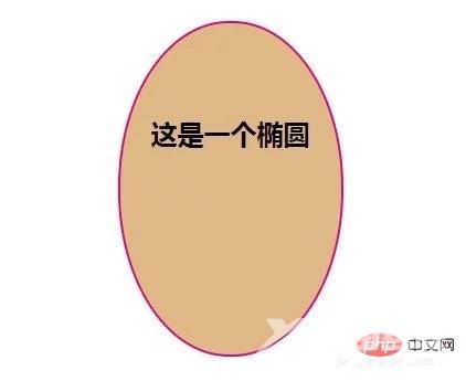
既然使用圆角边框可以绘制出一个圆,同样也可以绘制出一个椭圆。
例子:
css部分:
.box2{width:200px;height:300px;margin: 30px auto;border: 2px solid #e4007e;text-align: center;line-height: 200px;font-weight: bold;font-size: 24px;background: burlywood;border-radius: 100px/150px;}效果如图:
方法4:
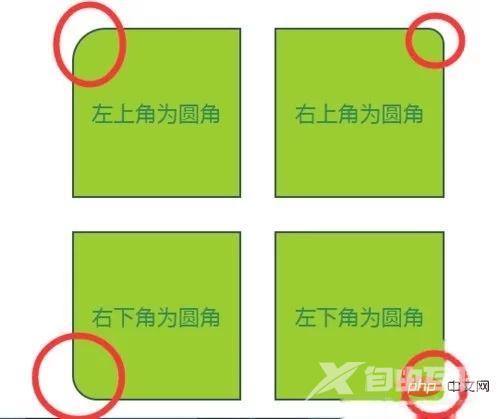
设置不同弧度的圆角
例子:
css部分:
#box4{width:500px;position: relative;margin:30px auto;}.div4,.div5,.div6,.div7{width:200px;height:200px;text-align: center;color:seagreen;font-size: 26px;line-height: 200px;background: yellowgreen;border:2px solid darkslategray;float:left;margin:20px;}.div4{border-top-left-radius: 40px;}.div5{border-top-right-radius: 20px;}.div6{border-bottom-left-radius: 30px;}.div7{border-bottom-right-radius: 10px;}效果如图:
注意事项
百分比大于50%后,形状就不会再变化了,圆角的半径不能超过宽/高的一半。
【推荐学习:css视频教程】