加菲猫欢乐跑
65.99M · 2026-03-26

css背景图加边框的方法:首先创建一个HTML示例文件;然后通过“background-image”引入一张背景图;最后通过border属性设置边框即可。

background-color: gray;background-color: #808080;background-color: rgb(128,128,128);
body{background-image: url("images/bg.jpg");}background-position属性值:
①使用关键字:background-position:center left
②使用百分数值:background-position: 50% 50%
③使用长度值:background-position:300px 100px
/*背景样式综合使用*/background: #00ff00 url(image/bg.jpg) no-repeat center;
background-attachment属性设置背景图像是否固定或者随着页面的其余部分滚动。
background-size: length| percentage| cover| contain;
cover和contain
<!DOCTYPE html><html><head> <meta charset="utf-8" /> <title>背景</title> <style type="text/css"> p{width: 700px;height: 400px;border: 2px solid plum;background-repeat: no-repeat; background-image: url(img/design.jpg);background-size: cover;} </style></head><body> <p>图片尺寸</p></body></html>background-originbackground-origin: border-box | padding-box | content-box;默认是padding-box
background-origin
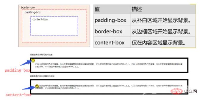
<!DOCTYPE html><html><head> <meta charset="utf-8"> <style> p{border:10px solid black;padding:35px;background-image:url(img/smiley.gif); background-repeat:no-repeat;background-position:0px 0px;} #p1{background-origin: padding-box;} #p2{background-origin:content-box;} </style></head><body> <p>背景图像边界框的相对位置:</p> <p id="p1"> CSS 允许应用纯色作为背景,也允许使用背景图像创建相当复杂的效果。CSS 在这方面的能力远远在 HTML 之上。CSS 允许应用纯色作为背景,也允许使用背景图像创建相当复杂的效果。CSS 在这方面的能力远远在 HTML 之上。 </p> <p>背景图像的相对位置的内容框:</p> <p id="p2"> CSS 允许应用纯色作为背景,也允许使用背景图像创建相当复杂的效果。CSS 在这方面的能力远远在 HTML 之上。CSS 允许应用纯色作为背景,也允许使用背景图像创建相当复杂的效果。CSS 在这方面的能力远远在 HTML 之上。 </p></body></html>background-clipbackground-clip:border| padding| content 指定背景在哪些区域可以显示,但与背景开始绘制的位置无关。背景的绘制的位置可以出现在不显示背景的区域,这时就相当于背景图片被不显示背景的区域裁剪了一部分。background-origin:padding| border| content 指定背景从哪个区域(边框、补白或内容)开始绘制。可以用此属性在边框上绘制背景,但边框上的背景显不显示出来就要由background-clip来决定了。<!DOCTYPE html><html><head> <meta charset="utf-8"> <style> #example1 { width: 800px; height: 450px; border: 20px dotted black; padding: 50px; background-image: url(img/girl.jpg); background-size: 100% 100%; background-repeat: no-repeat; background-clip: padding-box;/*padding-box以外的都要剪辑掉*/ background-origin: border-box;/*从border-box开始进行剪辑*/ } </style>s</head><body> <p id="example1"></p></body></html>边框样式常用的边框样式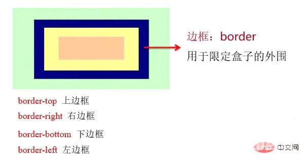
border
设置边框宽度:border-width 宽度值。示例: border-width:1px;
设置边框颜色:border-color 颜色。示例:border-color:#cccccc;
设置边框样式:border-style 样式关键字。示例:border-style: solid;
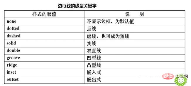
边框线类型
border: width / style / color 示例:border: 3px dotted#ff9900圆角边框——border-radius 属性。
border-radius: 1-4 length | %;border-radius属性可包含两个参数值,第一个值表示圆角的水平半径,第二个值表示圆角的垂直半径,两个参数值通过斜线分隔。如果仅包含一个参数值,表示两个值相同,即1/4圆角。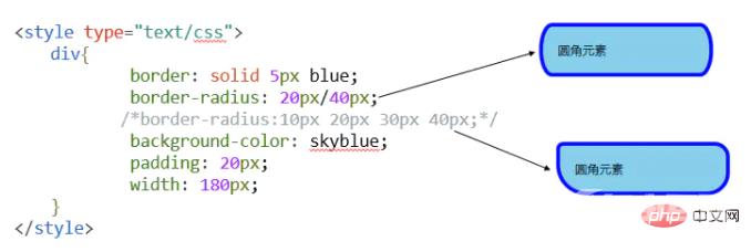
border-radius
如果要绘制的圆角边框4个角的半径各不相同时,需按左上角、右上角、右下角、左下角的顺序设置每个方向圆角半径的值。
border-top-left-radius、border-top-right-radius、border-bottom-right-radius、border-bottom-left-radius(绘制圆角边框的四个角的半径各不相同时,按照上述的顺序)bottom-right,则与 top-left 相同。如果省略 top-right,则与 top-left 相同。p{ border-top-left-radius: 0px; border-top-right-radius: 10px; border-bottom-right-radius: 20px; border-bottom-left-radius: 30px; /*上述的四句代码等同于:border-radius:0px 10px 20px 30px;*/}border-image图像边框——border-image 属性
border-image: url(图像文件的路径) A B C DABCD四个参数表示浏览器自动把图像分隔时的上边距、右边距、下边距以及左边距。
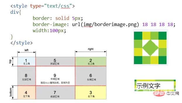
border-image 属性是一个简写属性,用于设置以下属性:
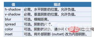
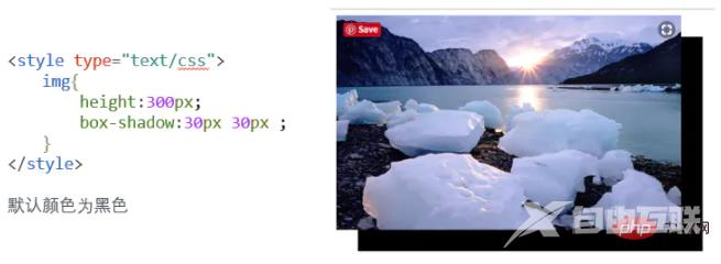
向框添加一个或多个阴影——box-shadow 属性
语法:box-shadow: h-shadow v-shadow blur spread color inset;