代号转生成为魔塔
52.35M · 2026-04-02

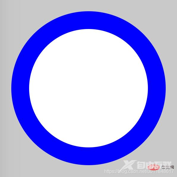
本篇文章通过代码示例介绍一下使用纯CSS画圆环的方法。有一定的参考价值,有需要的朋友可以参考一下,希望对大家有所帮助。
画圆环思想很简单:首先画两个圆,设置不同的背景色;然后让两个圆的圆心重合即可。
难度系数
☆☆
HTML
<div class="container"> <span class="ring-style"></span></div>
解析:
CSS
.container { position: relative; top: 0; left: 0; width: 300px; height: 300px; background-color: lightgrey;}.ring-style { display: inline-block; position: absolute; top: 50%; left: 50%; transform: translate(-50%, -50%); background-color: blue; width: 260px; height: 260px; border-radius: 260px;}.ring-style::before { content: ' '; display: inline-block; position: absolute; top: 50%; left: 50%; transform: translate(-50%, -50%); background-color: white; width: 200px; height: 200px; border-radius: 200px;}解析:
【推荐教程:CSS视频教程 】
效果图
知识点
更多编程相关知识,请访问:编程视频!!
【感谢龙石为本站数据质量管理平台提供技术支撑 http://www.longshidata.com/pages/quality.html】