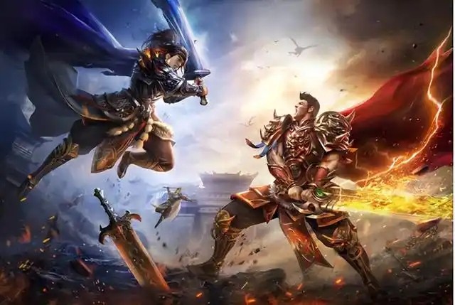
百战封神37手游
124.98MB · 2025-12-17
在我一篇随笔中其实有说到十大布局,里面有提到 flex 布局、grid 布局、响应式布局,不过没有提到容器查询这个,现在说下这三个布局然后穿插下容器查询吧。
适用场景:线性布局、动态内容对齐,例如按钮组、导航栏、商品卡片列表
.navbar { display: flex; justify-content: space-between; align-items: center; gap: 1.5rem; flex-wrap: wrap; @media (max-width: 768px) { flex-direction: column; }}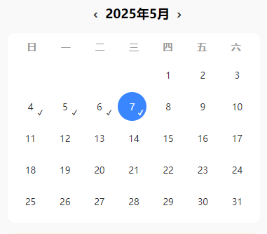
适用场景:二维布局、复杂排列
? 应用场景:日历打卡、微信服务页面九宫格布局
.calendar { display: grid; grid-template-columns: repeat(7, 1fr); gap: 8px;}.grid-menu { display: grid; grid-template-columns: repeat(3, 1fr); gap: 12px;}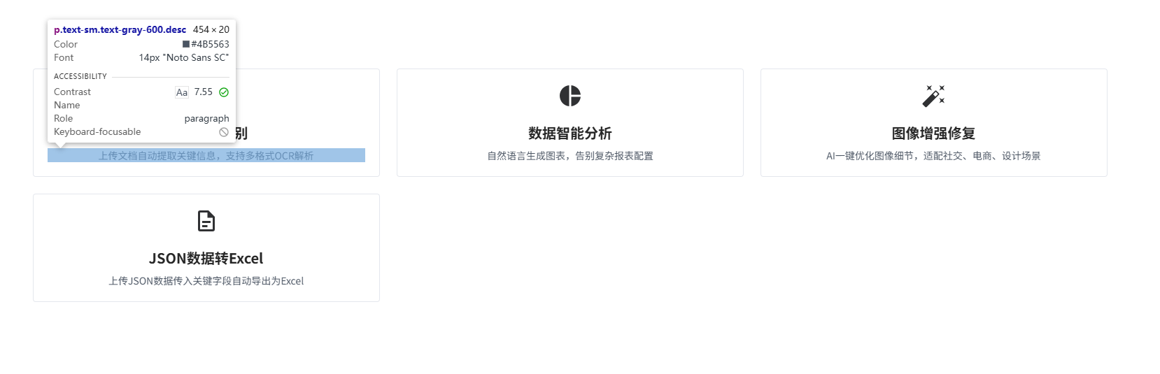
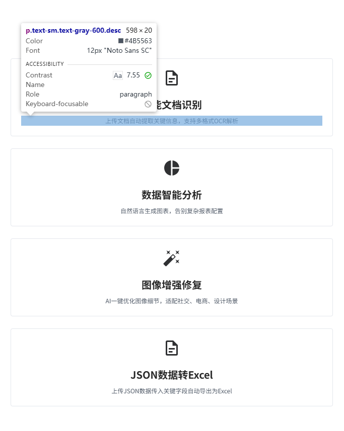
组件根据容器大小自适应,而非整个视口
? 应用场景:嵌套组件(如卡片、图表容器)
.card-container { container-type: inline-size; container-name: card;}.card { @container card (width < 800px) { .desc { font-size: 12px; } }}图片如上
适用场景:针对屏幕尺寸、设备类型进行响应式调整
? 应用场景:整体页面布局、字体、间距适配
$breakpoints: ( desktop: 1200px, tablet: 768px, mobile: 480px,);.card-container { display: grid; grid-template-columns: repeat(3, 1fr); gap: 1.5rem; padding: 2rem; @media (max-width: map-get($breakpoints, tablet)) { grid-template-columns: 1fr; padding: 1.5rem; } @media (max-width: map-get($breakpoints, mobile)) { padding: 1rem; }}
? 应用场景:用户信息卡片、登录弹窗背景等
.glass-panel { background: linear-gradient( 135deg, rgba(255, 255, 255, 0.15) 0%, rgba(255, 255, 255, 0.05) 100% ); backdrop-filter: blur(12px) saturate(160%); border: 1px solid rgba(255, 255, 255, 0.2); border-radius: 16px; box-shadow: 0 8px 32px rgba(0, 0, 0, 0.1), inset 0 4px 12px rgba(255, 255, 255, 0.2); @supports not (backdrop-filter: blur()) { background: rgba(255, 255, 255, 0.9); }}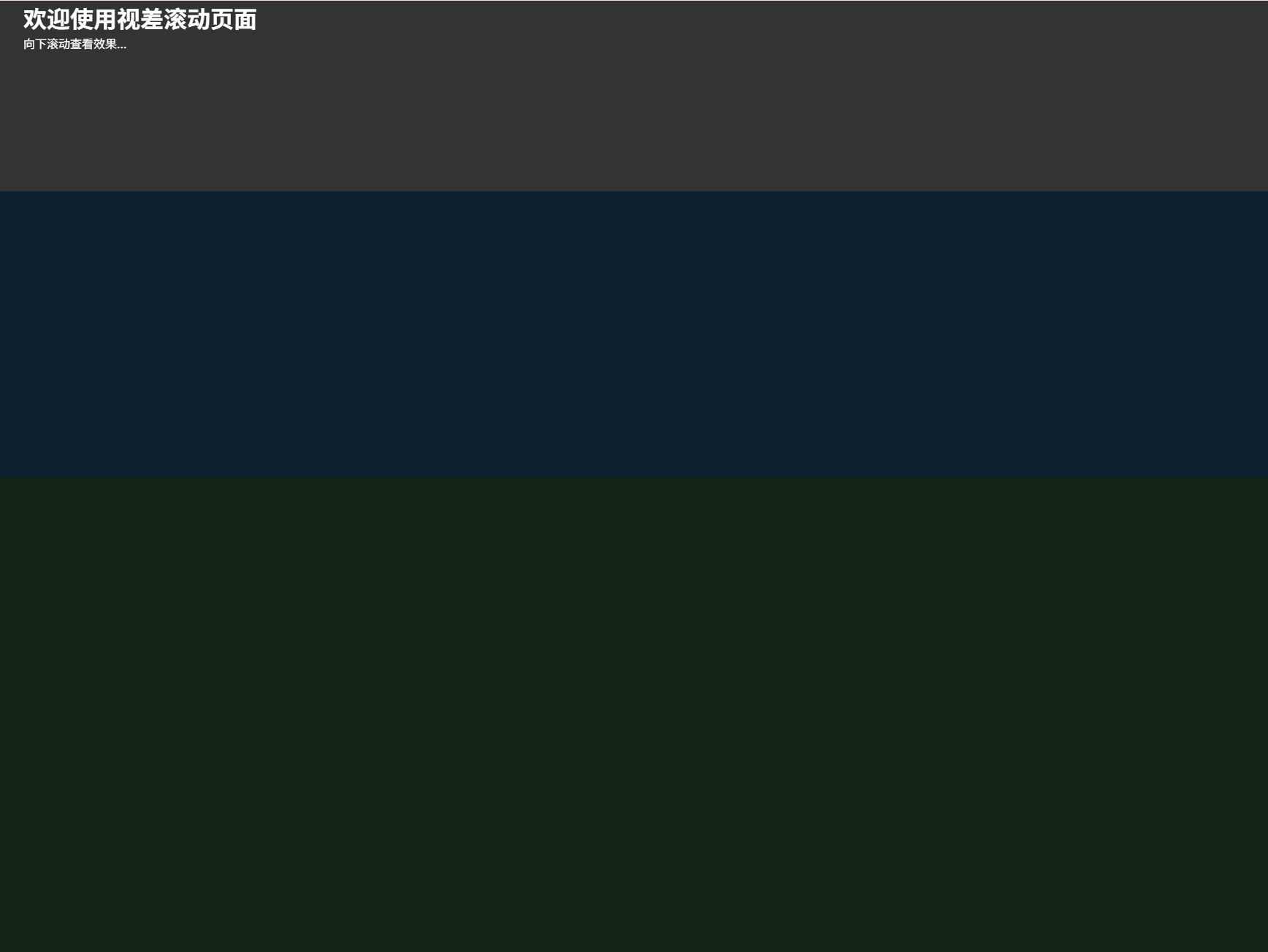
? 应用场景:活动页背景、Banner 页面动效
<div class="parallax-layer layer-1" data-speed="0.2"></div><div class="parallax-layer layer-2" data-speed="0.5"></div><div class="content"> <h1>视差滚动</h1> <p>向下滚动查看效果...</p></div>const layers = document.querySelectorAll(".parallax-layer");function updateParallax() { const scrollY = window.scrollY; layers.forEach((layer) => { const speed = parseFloat(layer.dataset.speed); const offset = scrollY * speed; layer.style.transform = `translateY(${offset}px)`; });}window.addEventListener("scroll", updateParallax);window.addEventListener("load", updateParallax);* { margin: 0; padding: 0; box-sizing: border-box;}body,html { height: 100%; font-family: sans-serif;}.parallax-layer { position: fixed; top: 0; left: 0; width: 100%; height: 100vh; background-size: cover; background-position: center; will-change: transform;}.layer-1 { background-color: #42a5f5; z-index: 1;}.layer-2 { background-color: #66bb6a; z-index: 2;}.content { position: relative; z-index: 3; min-height: 200vh; padding: 100vh 2rem 2rem; background: rgba(0, 0, 0, 0.8); color: white;}优先使用弹性布局 + SCSS 嵌套媒体查询 + 相对单位
| 单位 | 适用场景 | 示例 |
|---|---|---|
| rem | 字体/边距 | font-size: 1.2rem |
| vw/vh | 视口宽高 | width: 100vw |
| % | 相对父元素 | width: 50% |
| ch | 文本宽度限制 | max-width: 60ch |
.container { --gutter: clamp(1rem, 3vw, 2rem); padding-inline: var(--gutter); max-width: 1440px; margin: 0 auto; @media (width < map-get($breakpoints, tablet)) { grid-template-columns: 1fr; }}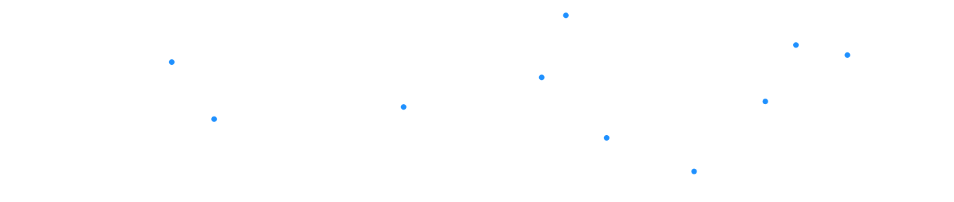
? 应用场景:粒子背景、按钮涟漪效果、可控图案
// 加载模块CSS.paintWorklet.addModule('circle-painter.js');// 使用样式.element { background-image: paint(circlePainter); --circle-color: #ff4757; --circle-size: 8;}// circle-painter.jsregisterPaint( "circlePainter", class { static get inputProperties() { return ["--circle-color", "--circle-size"]; } paint(ctx, size, props) { const count = parseInt(props.get("--circle-size")); const color = props.get("--circle-color").toString(); ctx.fillStyle = color; for (let i = 0; i < count; i++) { ctx.beginPath(); ctx.arc( Math.random() * size.width, Math.random() * size.height, 4, 0, 2 * Math.PI ); ctx.fill(); } } });!important
124.98MB · 2025-12-17
57.03 MB · 2025-12-17
53.11 MB · 2025-12-17